An exploration of designing for real users, focusing on readability, user experience, simplicity, and creating designs that feel clear and natural.
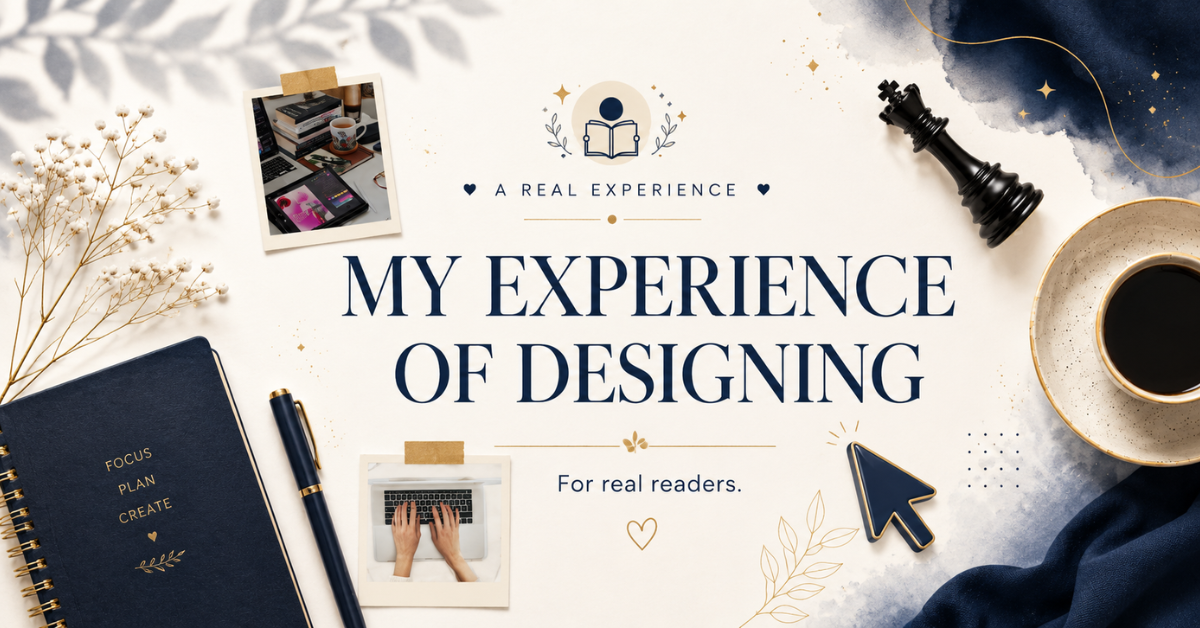
Designing for Real Readers: What I Learned From Real-World Experience
Most of my early design work was created for screens. I focused on how things looked inside Canva, how layouts aligned, and how visually appealing everything appeared in preview mode.
At that time, I believed good design was mostly about appearance. If something looked clean, modern, and visually balanced, I considered it successful.
But over time, I realized something important.
Design does not exist on a screen. It exists in the experience of the person interacting with it.
My first realization as a designer was about visuals and creativity. The next lesson came when I started noticing how real people actually experience design in everyday use. That shift completely changed the way I approach my work today.
Now, whether I am designing ebooks, Canva templates, social media posts, or digital products, I no longer think only about how something looks. I think about how it feels to the person reading it, scrolling through it, or interacting with it.
The Shift From Designing for Appearance to Designing for Experience
In the beginning, my focus was purely visual. I spent most of my time choosing colors, adjusting typography, organizing layouts, and trying to make every design feel modern and impressive.
But slowly, I noticed a gap in my thinking.
A design can look perfect inside a preview and still feel uncomfortable to use in reality.
Sometimes spacing looked visually balanced but felt too tight while reading. Some fonts looked stylish but reduced readability. Certain layouts appeared creative but made information harder to understand quickly.
That is when I started understanding design differently.
Good design is not what looks best inside a frame. It is what works best for the person experiencing it.
That realization changed the way I evaluate every project now.
Designing for Attention vs Designing for Understanding
One of the biggest lessons I learned is the difference between grabbing attention and supporting understanding.
In digital content, attention is easy to capture. Bright colors, bold typography, and strong visuals can immediately make someone stop scrolling.
But attention alone is not enough.
If the message feels confusing or difficult to follow, people move on quickly.
I realized that successful design is not measured only by how many people notice it. It is measured by how clearly people understand it.
This became especially important while designing ebooks and long-form digital content.
Readers do not stay because something simply looks attractive. They stay because the experience feels smooth, organized, and effortless.
Clean layouts create comfort. Clear hierarchy creates direction. Proper spacing reduces visual pressure while reading.
The more I observed real user behavior, the more I understood that clarity is often more powerful than decoration.
What Real Readers Actually Notice
When I started thinking from the reader’s perspective, my entire design process changed.
I stopped asking:
“Does this design look good?”
And started asking:
“Does this feel easy to experience?”
Because readers experience design very differently than designers do.
They often notice:
⦁ spacing before style
⦁ clarity before creativity
⦁ structure before color
⦁ readability before visual effects
Even small details shape the overall experience.
Line spacing affects comfort. Paragraph length affects attention. Typography affects trust. Visual breathing space affects focus.
Individually, these things may seem small. Together, they completely shape how someone feels while interacting with a design.
I realized that the strongest designs are usually the ones people do not struggle with.
Everything feels natural, balanced, and easy to follow.
Good design quietly guides the reader instead of demanding attention from every element on the page.
The Discipline Behind Simple Design
One of the hardest lessons design taught me is that simplicity requires discipline.
At first, I believed minimal designs were easier because they contained fewer elements.
Later, I realized the opposite is true.
Creating simplicity requires careful thinking. Every element needs a purpose. Every section needs balance. Every visual decision affects the overall experience.
Removing unnecessary elements is often harder than adding more.
Because simplicity is not emptiness.
It is clarity.
Every time I simplify a layout, improve spacing, or remove distractions, I am making the experience easier for the reader.
And that process usually requires more thought, not less.
I no longer try to add everything possible into a design.
Now, I focus on keeping only what genuinely improves communication.
Why This Perspective Changed My Work
Designing for real readers completely changed my priorities.
I stopped designing only for visual approval and started designing for usability.
I stopped focusing only on what looked creative and started thinking more about what felt natural and understandable.
That shift improved the quality of my work far more than any design trend ever did.
Because real design is not about showing how much you can add.
It is about understanding what people actually need from the experience.
Whether I am creating ebooks, Canva templates, social media posts, or digital products, I now think more carefully about the person on the other side of the screen.
Will this feel clear or overwhelming?
Will the design support the message or distract from it?
Will the experience feel smooth or frustrating?
Those questions matter more to me now than simply making something look impressive.
Final Thoughts
This shift from visual thinking to experience-based thinking has been one of the most important parts of my journey as a designer.
It taught me that good design is not only about decoration. It is about clarity, usability, structure, and respect for the reader’s experience.
And once you begin seeing design this way, it changes everything.
Because every project stops becoming just a visual layout.
It becomes an experience you are responsible for shaping.