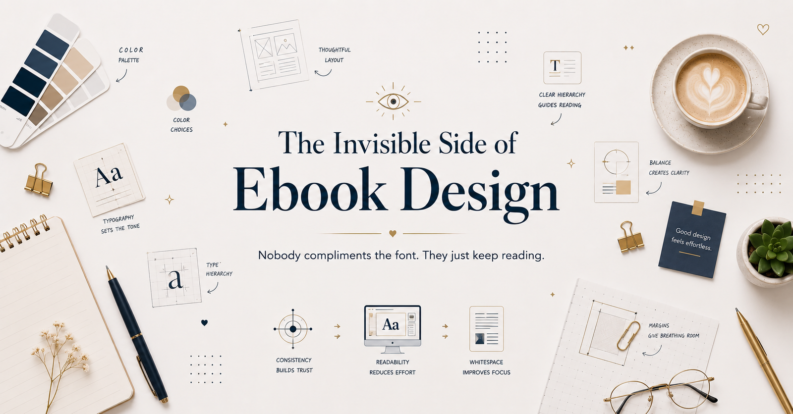
Great ebook design rarely gets noticed and that’s the whole point. A personal look at the quiet decisions, learned through real client projects, that make reading feel effortless.
Designing to Impress, Not to Serve
For a long time, I equated good design with being noticed. I wanted someone to open a page and feel, immediately, that a decision had been made there — bold typography, a decorative flourish, a color that pulled the eye somewhere specific. If a layout looked clever, I called it finished. It took years of working on real ebooks for real clients before I understood how backwards that instinct actually was.
The moment that changed things for me wasn’t dramatic. It was quiet, almost anticlimactic. I had just finished a fairly elaborate ebook layout for a client, something with layered typography, decorative dividers between sections, and a color palette I was proud of. I expected feedback about the visual choices. Instead, the client wrote back and said the book “felt really easy to get through” and that she “didn’t even notice she’d read forty pages.” She wasn’t talking about my design decisions at all. She was talking about the absence of friction. And somewhere in that email, I realized she had just described the entire goal of design without knowing she was doing it.
That client’s response stuck with me longer than any compliment about typography ever could, because it forced me to admit something uncomfortable: the parts of my work I was proudest of were often invisible to the very people I was designing for. Readers were never going to notice my carefully chosen line spacing or the way I’d adjusted kerning on a heading for the third time that day. They were only going to notice whether reading felt easy or whether it felt like work. And that single distinction, once I actually understood it, changed how I approached every project after it.
Two Different Ways of Reading the Same Page
Designers and readers experience a page in fundamentally different ways, and this gap is easy to miss if you spend most of your time inside design software rather than inside the reading experience itself. When I open an ebook now, professionally, I notice margins first. I notice whether paragraph width sits in a comfortable range, whether headings carry enough visual weight to signal a new section without shouting, whether spacing between elements feels deliberate or arbitrary. These are the things I’m trained to see. A reader opening that same ebook is not doing any of that. They are not evaluating whether a heading aligns to an invisible grid. They are asking something much simpler, almost without noticing they’re asking it at all: is this easy to follow? If the answer is yes, they keep reading, and the design has done its job perfectly by doing nothing that draws attention to itself. If the answer is no, most readers won’t be able to articulate why. They’ll just feel a kind of quiet fatigue, and eventually, they’ll put the book down without fully understanding what stopped them.
Learning Restraint the Hard Way
Ebooks are especially prone to over-design. There’s a quiet pressure in digital publishing to make every page feel “interesting,” as if visual excitement is what keeps someone reading. In my experience, it’s almost always the opposite. On one project, an ebook for a business coach, I used a different accent color for every chapter, thinking it would keep things fresh. When I read the whole draft straight through, I caught myself thinking about the colors instead of the content. I pulled it back to one accent color, used sparingly, and the book immediately felt calmer. The writing hadn’t changed at all. Only the restraint had.
That project taught me something I now treat as a working principle: the most important design decisions are usually the least visible ones. Nobody has ever emailed me to compliment consistent margins. Nobody has ever said a paragraph’s line-height made their day. Yet these are the decisions doing the actual work of the entire reading experience, every single page, whether or not anyone consciously registers them. Comfortable spacing is the reason reading doesn’t feel exhausting after twenty pages. Balanced typography is the reason attention doesn’t drift by chapter three. Clear, consistent headings are the reason a reader can skim back to find something without frustration. None of it asks for credit. It simply makes the experience feel natural, which was the entire point from the beginning.
On Dieter Rams and the Discipline of Less
There’s a line from Dieter Rams that I return to often, not because it’s a clever soundbite, but because it names something I only understood after making the opposite mistake repeatedly: “Good design is as little design as possible.” Rams was talking about physical products when he said this, but it applies just as precisely to a page of text. Every unnecessary visual element is one more thing a reader’s mind has to process before it can get to the actual content. Every decorative flourish is competing, even slightly, with the words it’s supposed to be supporting. I didn’t fully believe this until I saw it happen in my own work, watching a reader’s attention get pulled toward a design choice instead of staying with an author’s sentence. Once you see that happen, you stop wanting to be the reason it happens again.
Treating White Space as Structure, Not Absence
White space plays a bigger role in this than I gave it credit for early on. I used to treat every empty area of a page as an unsolved problem, something that needed an icon, a graphic, a decorative rule, anything to fill it. Looking back at some of my early ebook layouts, I can see exactly where that instinct made things worse instead of better. Pages felt crowded, busy, slightly anxious, even when the actual content was calm and well-written. White space isn’t empty. It’s structural. It gives the eye somewhere to rest between ideas, it separates concepts without needing a visual divider to do it, and it lets the one important sentence on a page stand out simply because nothing else is competing for that same attention. Now, when I finish a layout, I don’t ask what else I could add. I ask what I can take away. That single question has improved more of my ebook designs than any new technique or trend ever has.
Consistency Is Only Noticed in Its Absence
Consistency works in a similarly quiet way, and it might be the most underrated principle in ebook design specifically, because ebooks are read over long stretches, often across many sittings. A reader will never consciously notice that every heading in a book follows the exact same style, or that margins never shift by even a pixel from one chapter to the next. But they notice instantly, almost physically, the one time that pattern breaks. That contrast is where trust either holds or slips. Consistency creates familiarity, familiarity creates comfort, and comfort is what allows a reader to stop thinking about the container and focus entirely on what’s inside it. I think about this every time I format a new ebook now. It’s no longer a stylistic preference. It’s closer to a form of respect for the reader’s attention, which is the only thing they’re really giving you when they open your book.
What Creativity Actually Means in This Work
My definition of creativity changed around the same time. I used to measure it by how much I could add to a page. Now I measure it by how naturally I can guide someone’s attention without them ever noticing they were being guided at all. A well-designed ebook doesn’t compete with an author’s words. It supports them so quietly that the support becomes invisible. Typography that makes reading feel effortless. Layout that creates a rhythm the eye can follow without resistance. Hierarchy that tells a reader exactly where to look next, without ever making them stop and think about where to look next. Antoine de Saint-Exupéry wrote a line that captures this better than anything I could come up with myself: “Perfection is achieved, not when there is nothing more to add, but when there is nothing left to take away.” I think about that sentence almost every time I’m tempted to add one more decorative element to a page that doesn’t need it.
Whose Experience Am I Actually Building For
The biggest shift in my work, though, wasn’t really about software or technique. It was about whose experience I was actually designing for. Early in my career, I designed from my own perspective, chasing what looked impressive to me on a screen. Now, nearly every decision starts with a question about the reader instead. Will this feel immediate the moment they open the page? Will the spacing reduce fatigue by page fifty, not just page one? Will the whole experience feel like it was built for them to move through easily, from the first page to the very last? Success, in my current work, isn’t measured by how many people compliment the design. It’s measured by how many people finish the book without ever consciously thinking about the design at all.
The Only Metric That Still Matters
That’s ultimately the standard I hold every ebook project to now. The strongest layouts I create are almost always the quiet ones. They don’t lean on decoration to prove their value, and they don’t demand attention that belongs to the words on the page. They remove confusion instead of adding personality, and they create clarity instead of chasing style. Whether I’m designing an ebook, a digital template, or any other product meant to be read and used, the goal has stayed the same since that first email from a client who didn’t even realize she was describing good design. If someone finishes a book remembering the ideas clearly, but never once thought about the typography, the spacing, or the layout that carried those ideas to them, then the design did exactly what it was supposed to do. Great design isn’t remembered for how loudly it speaks. It’s