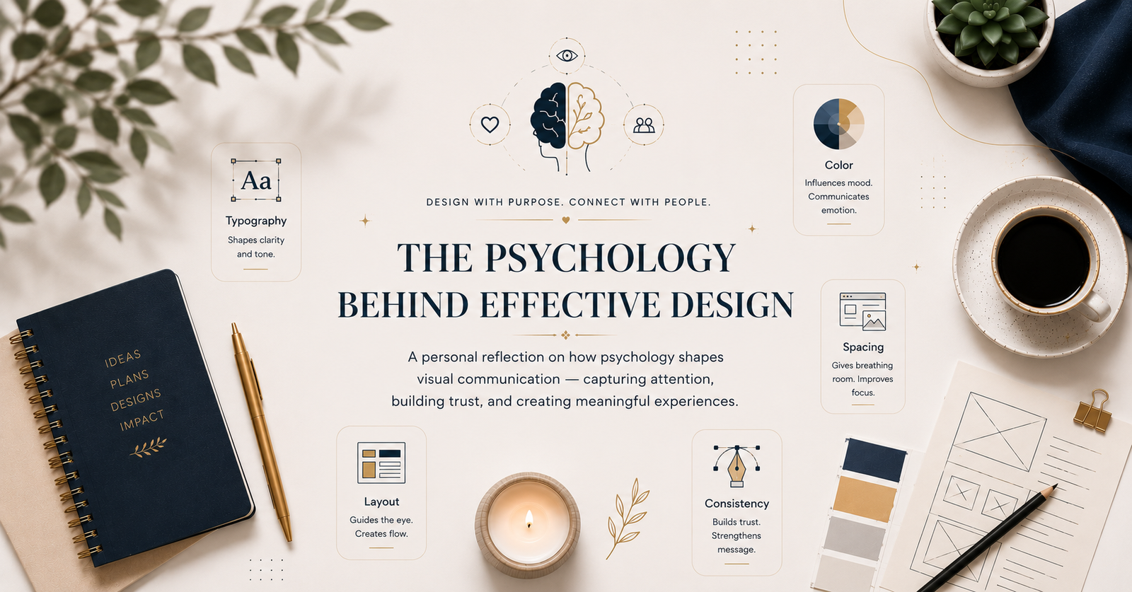
A personal reflection on how psychology shapes visual communication capturing attention, building trust, and creating meaningful experiences.
Design Begins Before People Start Reading
When I first started designing, I believed that good design was mainly about making things look beautiful. If the colors worked well together, the typography felt modern, and the layout looked balanced, I considered the design successful. I spent hours choosing fonts, adjusting spacing, and experimenting with layouts because I thought creativity alone was what separated an average design from a great one.
As I worked on more ebooks, Canva projects, social media posts, and digital products, my perspective gradually changed. I realized that people do not experience design the way designers do. They are not studying alignment or analyzing typography. Within seconds, often before reading a single sentence, they decide whether something feels clear, trustworthy, and worth their attention.
That realization completely changed the way I approach design. I stopped thinking about visuals as decoration and started seeing them as a form of communication. Every font, every color, every margin, and every piece of white space influences how people feel. That is where psychology quietly becomes part of the creative process.
The First Impression Is Psychological
Before readers evaluate the quality of the content, they subconsciously evaluate the quality of the presentation. A clean layout, clear hierarchy, and balanced spacing immediately create a sense of comfort, while clutter and inconsistency create hesitation.
I noticed this while comparing different ebook layouts. Even when two documents contained the same information, the one with better structure always felt more professional. I eventually realized that effective design is not about impressing people. It is about removing confusion before it appears, allowing readers to focus entirely on the message.
Why Visual Hierarchy Feels Natural
Early in my journey, I wanted every element to stand out. Bold headings, multiple colors, and competing visual elements made my designs feel busy rather than useful. Over time, I learned that when everything demands attention, nothing truly receives it.
The human brain naturally looks for order. A thoughtful visual hierarchy quietly guides readers from one idea to the next without making them think about where to look. That invisible guidance is one of the strongest signs of effective design.
The Quiet Confidence of White Space
I once believed empty space meant wasted space, so I filled every corner with text or graphics. Later, I discovered that the most professional designs often contain the most breathing room. White space reduces mental effort, improves readability, and allows important ideas to stand out.
“Simplicity is the ultimate sophistication.” — Leonardo da Vinci
That quote reminds me that strong design is often created by knowing what to remove rather than what to add.
The Emotional Influence of Color
Color communicates before words do. Today, I choose colors based less on personal preference and more on the feeling I want readers to experience. A business ebook, a planner, and a children’s workbook all require different emotional atmospheres. Color is not decoration; it is communication.
How Typography Shapes the Reading Experience
Typography quietly shapes every reading experience. Readers rarely notice good typography, but they immediately notice poor typography. Comfortable spacing, consistent font choices, and readable text allow people to focus on ideas instead of struggling with presentation.
“The details are not the details. They make the design.” — Charles Eames
Typography proves that small decisions create the biggest difference
Why Consistency Builds Trust
Consistency communicates reliability. When layouts, headings, colors, and spacing remain predictable, readers feel comfortable because they always know what to expect. That quiet consistency builds confidence and strengthens trust throughout the entire experience.
Designing for Human Behavior
The biggest lesson psychology has taught me is that every design should begin with people instead of software. Before starting any project, I now ask whether the layout feels natural, whether the typography supports reading, and whether the overall experience reduces effort for the audience. Creativity matters, but clarity matters more.
Final Thoughts
Looking back, I no longer believe effective design is created through creativity alone. It is created through observation, empathy, and an understanding of how people naturally process information. Psychology has taught me that every design decision influences the way someone experiences a message. My goal is no longer to create designs that simply look impressive. I want to create designs that communicate clearly, feel effortless to use, and leave readers with an experience that is meaningful long after they leave the page.